Introduction
After completing this work, which involved a surprisingly short briefing, I contacted the responsible person and asked for another favor. My idea was to conclude this article with a short testimonial, which I asked for. A day later an E-mail arrived, with a text you’ll be reading. It was way above my expectations, so I used it as a body text instead. Please don’t mind my own short notes here and there, mainly commenting on development phases. I did try to stay out of the way.

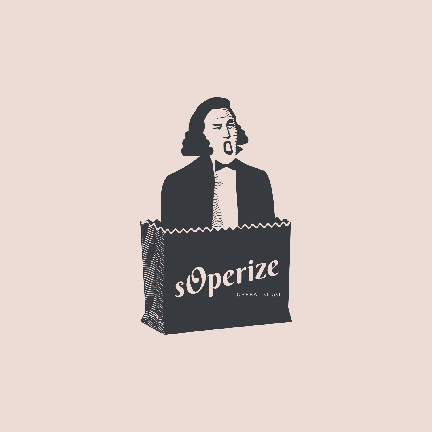
“sOperize is a startup company in a relatively new field of business. It combines professional classical music, show business, and promotion. The idea is to perform an opera flash mob in a public café, restaurant or hotel to attract new costumers and generally promote their business. One of the main thing for an entrepreneur is a high quality, recognizable logo.”

Not this one! This is just a quick sketch that inspired visual direction of the logo. 🙂
“My first instructions to Vladimir were to combine the elements of the opera, stage, nature and something out of a public place. I described the character of the logo as professional and at the same time casual because the goal of the company is to bring the art of the opera to a wider public.”

Admittedly I started a bit blatant, but it does work sometimes.
“After a week Vladimir presented his first sketch of the logo in three different versions. I was already happy with the result because he went in the exact direction which I described earlier. It looked already very professional and also he added a touch of humor, which went perfectly together with the whole concept. A typical figure of an opera singer jumping out of the bush was the first design.”